When the stars align, a new Viber version release coincides with an operating system release and, this week, we celebrated that happy coincidence when we introduced Viber 6.3.1 for iOS. The new version is fiercely dedicated to making your life easier and your regular communications more convenient.
Ilia Blinderman, who is responsible for the iOS app at Viber, tells us all about the new, jazzed-up interface color and integration with core iOS 10 functionalities that this version has to offer.
Everyone seems to be excited about iOS 10 and I’ve seen you smiling to yourself around the office. What are you so happy about?
I think it goes without saying that I’m a diehard Apple fan. My day-to-day revolves around Apple products and I love managing the iOS products here at Viber. It’s always exciting to release a new version of Viber, but I am especially proud of our latest release as it was featured in the App Store when iOS 10 was released. It’s a big deal and we’re truly honored to be there.
That’s really cool. What gets an app featured in the App Store?
Featured apps are the ones that have the most value to offer to users through the newest iOS core functionalities. They are the ones that deliver on their promise through beautiful and intuitive user interface, integrating with iOS capabilities and creating an enjoyable user experience. These are apps that fit seamlessly into people’s daily lives and have a mission to make them better.
“iOS 10 opened the door for apps to better integrate with Siri, which, to me, is an absolute essential for @Viber.” – Click to Tweet
It sounds like Apple makes an effort to ensure it only features apps that they believe add value to consumers. What about this version of Viber does that?
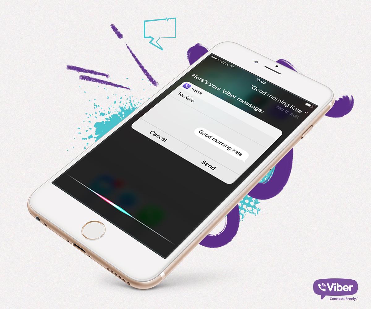
iOS 10 opened the door for apps to better integrate with Siri, which, to me, is an absolute essential for Viber. As a messaging app, we get our kicks from keeping people connected, hearing their stories about how Viber was there for them and helping them keep in touch with their loved ones in the most creative and expressive ways possible. But we cringe at the thought of users doing any of that when they shouldn’t be – like when they are driving, for example. Viber for iOS 10 harnesses the power of Siri and allows users to use Viber, hands-free, whenever they want.
That’s incredible. What kind of commands are supported?
You can tell Siri to send a message to a specific person or to a group conversation on Viber. You can also initiate a free call – audio or video – with Siri. It’s actually quite cool. If I say “Siri, start a video call with Shai on Viber,” my front-facing camera will open and Viber will start dialing you.
If we’re already talking about video calls, it’s worth mentioning that we made some interface changes that simplify the call screen and make way for what is most important, which is obviously the video itself. We analyzed the data and saw that some of the buttons on the screen are rarely used, so we went ahead and cleaned them off of the interface and kept the ones that matter.
We make a lot of product decisions based on usage data – it’s what enables us to continuously improve the app and keep it in line with what users need, without them having to tell us explicitly. Another example: we noticed that 80% of audio calls are initiated from one-on-one conversations so we made room for a video call button as well on that screen to make users’ lives easier.
Very cool. Do you find that data-led decisions make for a better product?
Oh, without a doubt we are able to create a better experience for our users when we have solid analytics to lean on. Of course, we always weigh the data insights with our own accrued intuitions to come to decisions that affect users.
What else is new and exciting in this version?
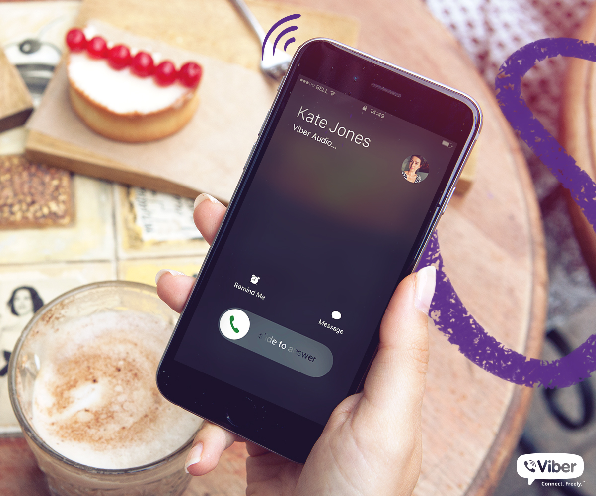
One of the things we’ve wanted to do for a long time, but couldn’t because of iOS limitations, is to integrate with the native call screen. Until now, incoming calls came in the form of push notifications. This wasn’t unique to Viber – all calling app developers faced the same issue. What this meant for users is that they’d miss calls – a lot of them – and it made for plenty of frustration. When iOS 10 became available to developers, we knew this was an integration we were going to take full advantage of.
Viber calls are fully integrated with iOS 10’s native call screen so that you never miss a call again! – Click to Tweet

So now when I get a Viber call…?
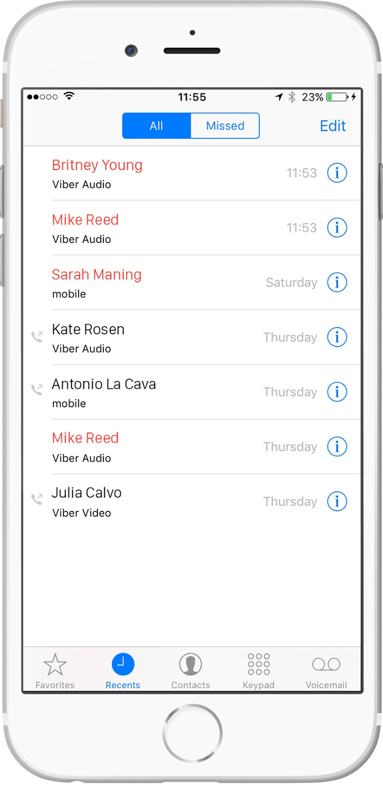
Now, when you get a Viber call, the screen looks just like the regular incoming call screen, with an indication that it is a Viber call under the caller’s name. And – this is my favorite part – calls you get through Viber are logged in your native call screen. When you tap on a Viber call in the call screen, Viber opens automatically so that you can continue to communicate with that person the way you are accustomed to.
Anything else?
I think most people will notice the new interface color. That’s a cross-platform change. All Viber platforms now have a new purple shade to them and a clean background. It makes for a really crisp look and feel that we wanted to give the app as a whole.
Ilia, thanks so much for taking the time to talk with me today. I’m especially excited because I’m a newly converted iPhone user and all of these improvements are relevant to me. I’m sure that our readers will appreciate an inside look you’ve given us of what goes on behind the scenes here. It was certainly eye-opening for me!
My pleasure – enjoy the new version!
You can get the latest version of Viber for iOS here.


